Meet the new Bucket logo
Until today, this was the Bucket logo:

I randomly found it on Flaticon, and it has served us very well - but now it’s time for Bucket to get its own logo...
Bit of background
Bucket’s mission is to help feature makers - engineers, designers, managers, technical product managers - measure and validate features. Are users engaging with the feature, and how often? Is the feature a success or does it need another iteration?
When describing the path for the Bucket product, I often refer to CI tools or monitoring tools, like Datadog, as inspiration. CI tools are interesting in comparison as they are an extension of the pre-deployment workflow. They run silently in the background and report back, when necessary, to the platforms you already use, e.g. GitHib or Slack. That’s very similar to how Bucket will work as well. Datadog is interesting in comparison as it gives you a predefined dashboard for a server instance and lets you easily share the dashboard metrics to other platforms, like Slack. On Bucket, you're not monitoring a server instance, but a feature.
Happy helper
Data-heavy products, like product analytics, often end up with a generic looking logo or the globe-with-connected-dots thingy. I don’t want that. It’s too abstract and it’s boring. I want the exact opposite for Bucket.
The Bucket product is a helper. A background worker that is an extension of your team. Bucket is empathetic to how you and your team works and it’ll integrate with that workflow. You ship a feature and Bucket will monitor it and let you know, if whether the feature is a success with your users or not.
First sketch
With all of the above in mind, I started working on a new Bucket logo. I wanted it to have personality, be playful and have a clear indication of the product value-proposition. Speaking of CI tools, the Travis CI logo was nice inspiration!
Here’s my initial sketch:

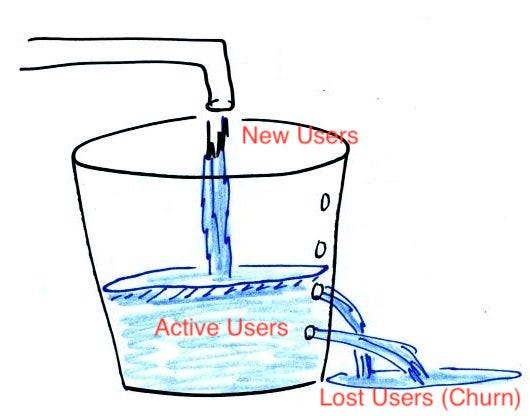
The bucket represents a product feature. The bucket is full because it has no leaks (source). Ergo, the users of the feature are happy and continue to use it. They don’t leak away.
Since the users are happy, the bucket is happy! I thought it was an *absolutely brilliant* idea to repurpose the bucket handle as the bucket’s smile! The designer ended up disagreeing...
Finding and iterating with the designer
I browsed Dribbble for a designer that had done logos in a style that matched the above criteria, in particular personality and playfulness. I quickly found Manu, a very nice Italian freelance designer, and reached out. He quickly responded and was up for the challenge.
Scroll down to see all of Manu’s iterations, including the final logo. It took about a week and 53 emails to get from first iteration to last iteration!


Meet the new Bucket logo
Finally - here is the final logo. We did the final tweaks in-house. As you can tell, we ultimately had to ditch my *absolutely brilliant* idea of repurposing the handle as a smile.
We’re super happy with how it turned out. Hope you like it as well!
Also, I really like how the favicon-version of the logo worked out. Check it in the browser tab.